 |
 |
 |
 |
 |
 |
 |
|
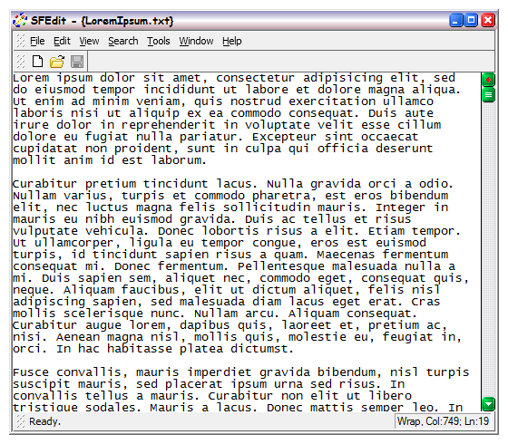
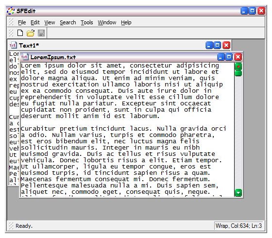
The main frame windowMuch of the functionality in these pages is going to be completely intuitive for most people. We do, however, feel that we have to say something about the windowing framework. Overall this folder simply aims to hilight the general capabilities of our application framework. Our application framework is a conglomeration of different ideas, all of which you will probably have seen before. We have attempted to follow the form and convention of those ideas, so that there is no need to have to find out how to use it. If you do decide to read on, hopefully this section will serve as a reminder as to what our framework will do. All our GUI applications are implemented on our VGui-VObject library. The outline of all our applications is the same. Central to the Solid Fluid GUI framework is the frame window, and it may operate in one of two simple modes, which are defined when an application is created. Single document mode, in recent years this is the more prevelent approach to application design on the windows platform. It essentially limits the user to viewing one document at a time, hence the name, single document. The slightly older approach is the multiple document interface (MDI), which allows a user to have more than one document visible at a time by allowing document windows to float, in a nondescript central window. Niether approach absolutely prevents an application from having more than one document open at a time. Without the more modern user interface development of tabbed documents, the single document interface (SDI) is so limited. Without tabbed documents, there would be no way to switch between open documents in an SDI model. Here, with the prevalence of the SDI model, we miss the multiple document interface quite a lot. It is arguable that the multiple document interface, has no benefit over the single document interface, but we don't follow that argument. In the strictest sense, the old style SDI and MDI frameworks are shown below. Click the images for a larger view.
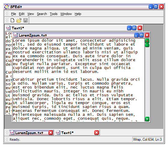
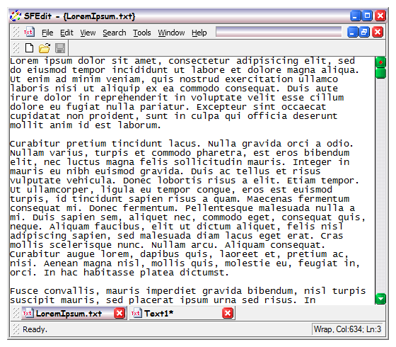
The limitation of MDI is that when one has many windows open simultaneously they naturally ovelap, and by virtue of Murphy's Law, the one wanted is always obscured by all the others. No amount of cascading and tiling make it possible to see the window you want so that it can be clicked to begin work. Obviously we can't deny this problem exists. The limitation of the SDI (with the modern tabs) is that when you're working in a window the mouse cursor is naturally over that window. To change documents requires that the user either, cycle through all the open windows on the keyboard, or grab the mouse and hit a tiny little tab. In the circumstance that the user actively manages the number of windows they have open, which we do, the problem where document windows become obscured is minimal. In addition with MDI, the target for the mouse click (the inactive window) is much bigger than the little tab button, and it's nearer to where the mouse already is, by probability. In fact, the modern form of the SDI interface (with tabs) is little different from the old MDI interface when maximised, except that it has tabs. Our interface then, implements tabs in a complete, old MDI format. The advantage of this is that unlike much modern software the user is not prevented from using the MDI interface. Any time you feel you want it, all you do is restore the current document to floating. With large modern displays, the dot pitch is not changing, and displays themselves are getting bigger. This means there is more room to have two documents open, side-by side, without making the text tiny and unreadable. If you are limited by the standard SDI interface software, this is an uncomfortable waste. Implementing a taskbar-like toolbar, we call the document bar, means that you can maximise a window, and use it just like a modern SDI application with tabs. Our tabs are reassuringly square and chunky, so they're easy to click. In those circumstances where you can't avoid having many documents open at once, this bar is available to allow tabbing between documents. The document bar is, in fact, always available. In practice we find it quite handy to work with both the document bar, and the MDI at the same time. Since this document selector is a bar, it can be placed at the top of the application window, as has become the general convention for tabs, or at the bottom which is the general convention for the Windows Task bar. Our MDI interface is just like the old style MDI Interface, but the document bar provides tabs. The tabs augment MDI when document windows are restored, and matches the modern SDI when document windows are maximised. Click the images for a larger view.
In some cases it is necassary to limit the capability of an application to just a single document at once. The reasons for this are mainly programmatic, but are often varied. A typical example of why, might be the case where the document actually represents the state of a server machine. In this case it would be typical that the application as a whole owns the connection to the server, and then it makes sense to only have a single document representing the connected server state. We do provide a single document interface for just this purpose, but naturally it does not support the document bar. At the beginning we suggested that we support both the MDI, and the SDI. For the majority of applications we produce the MDI is used, since it has the most flexibility for the user to manage as they wish, SDI or MDI. We can limit this behaviour, but only do so when the nature of the application demands it. |
Copyright © Solid Fluid 2007-2025 |
Last modified: SolFlu Tue, 30 Jun 2009 23:23:04 GMT |


